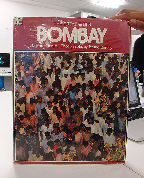
Bombay Book Cover
I attended a group tutorial that was held for all the Graphic Design MA students on the 13th of Dec. I felt it was important to gain some perspective on my project, since graphic students would have a different point of view when it came to Interactive Media. Peer feedback is always helpful, and I was simply curious about the kind of projects the other MA students were working on. The one-day workshop was moderated by Phil Jones, and involved all of us creating a quick piece of graphic work based on an open-ended brief. We were instructed to find an object or a photograph that had anything to do with our chosen topic, in my case, Mumbai. Since we had just 30 minutes, I ended up with a Time and Life book on Bombay, and chose the cover as my topic of study.

What followed was a group analysis, dissecting the object in terms of semiotics, its source, context, its materials and other relevant factors that give it meaning. After the analysis each person was given a new brief: to convert or transform the object into a graphic work keeping in mind theanalysis and discussion. Each person was given two hours to create a finished piece of graphic work.
During the discussion several people mentioned "dots" as a recurring shape in the cover, as each person was reduced to a dot. Another point was how the photograph transformed many individuals into one large mass of colour. My aim was to reduce the cover to its basic colours and shapes. In one way the poster is a mockery of the original object, as it strips it of meaning. At the same time is still comparable to the original when placed next to the other because of similar shapes, alignment and colours.

