It's not AI! Designing for automated conversations
Below are a few practical things we learned as a design team when building automated conversations for our two products ReferralCandy and CandyBar.
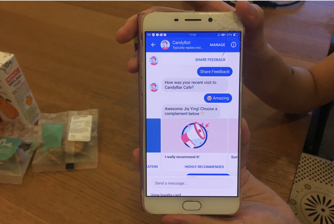
A snapshot of CandyBar Assistant. It tells people how many rewards, stamps and points they have
Why automated conversations?
For us, it all started with an experiment.
We had an SMS being sent out, and we wanted to make it better i.e. more useful, helpful, more engaging and interesting.
Trying to make the SMS shorter, cleaner, with neater links
We did a ton of usability testing on the SMS flow. The results were not great. People didn’t notice the message. It didn’t feel relevant, engaging or interesting.
We had to figure out a better way of messaging people.
Our first MVP experiment with automated messaging was with Facebook Messenger.
Results looked good! Our engagement went up, our testing lead to better results, more people were giving feedback about the places they visited, and conversions looked good too.
So here’s what I learned from the last two years of building automated conversations with my team:
1. Don’t make it look like a human
Samantha is not a real person. Her photo is from unsplash.com, a website for free to use commercial photos.
Trust is fragile in an automated conversation.
Make sure your automation clearly looks like a bot. An automation cannot do human tasks.
Be honest and transparent that it’s just a bot and therefore it’s limited. Use non-human names and avatar images.
Our product is both merchant facing and customer facing. So our interface and bots speak to both end consumers and merchants who want to connect with their customers in a meaningful way. We also have an excellent customer support team talking to these folks.
In a complex situation where both people and bots are helping out, clearly differentiating between the two is the key between a good or effective experience and a bad or confusing experience.
2. Design basics are the same, but your tools are different
Stick to a typical iterative product design process.
Your qualitative and quantitative user data is in the center of your process as you ideate and test your ideas in the real world. Make sure you are measuring the right thing. Your success metrics should be chosen carefully.
We did a lot of testing especially for the first MVP automated conversation
But your tools are different
Sketch isn’t the best way to draw your MVP Conversation
Initially I tried to make detailed mockups but my team found it difficult to understand the MVP concept and design updates this way.
Some initial sketch mockups for the MVP
We were iterating too fast (every 2 days) for good looking mockups.
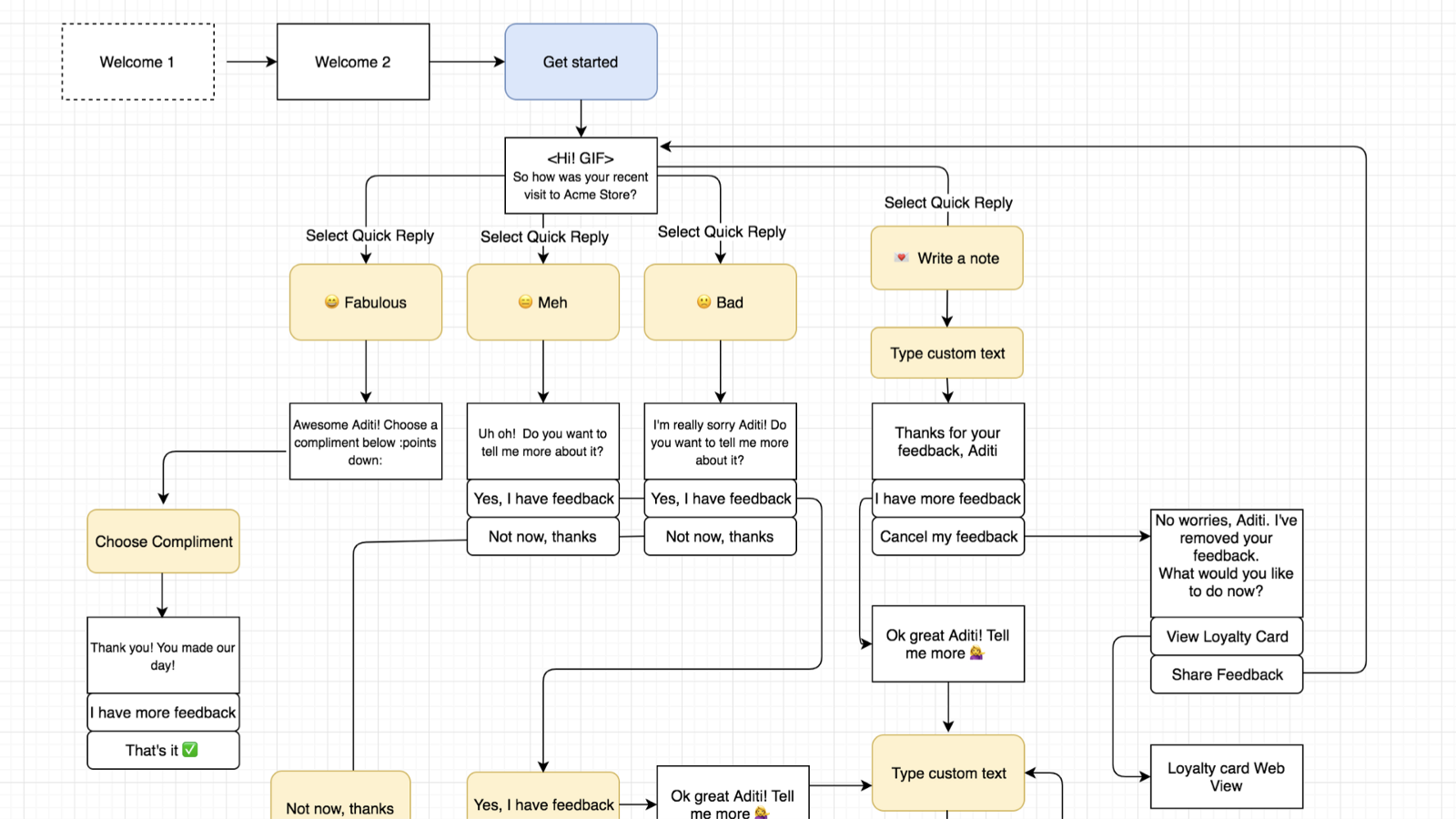
What actually worked:
Conversation tree for the MVP
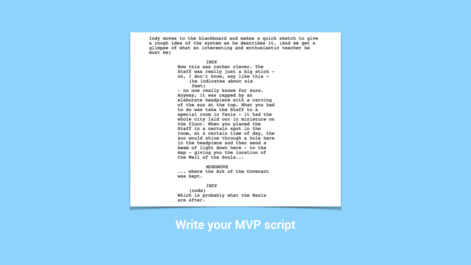
Then, write an MVP script to test each flow
Imagine your MVP conversation like a movie script with characters, stages and scene changes. This will help you test each flow properly, so that it sounds as natural as possible.
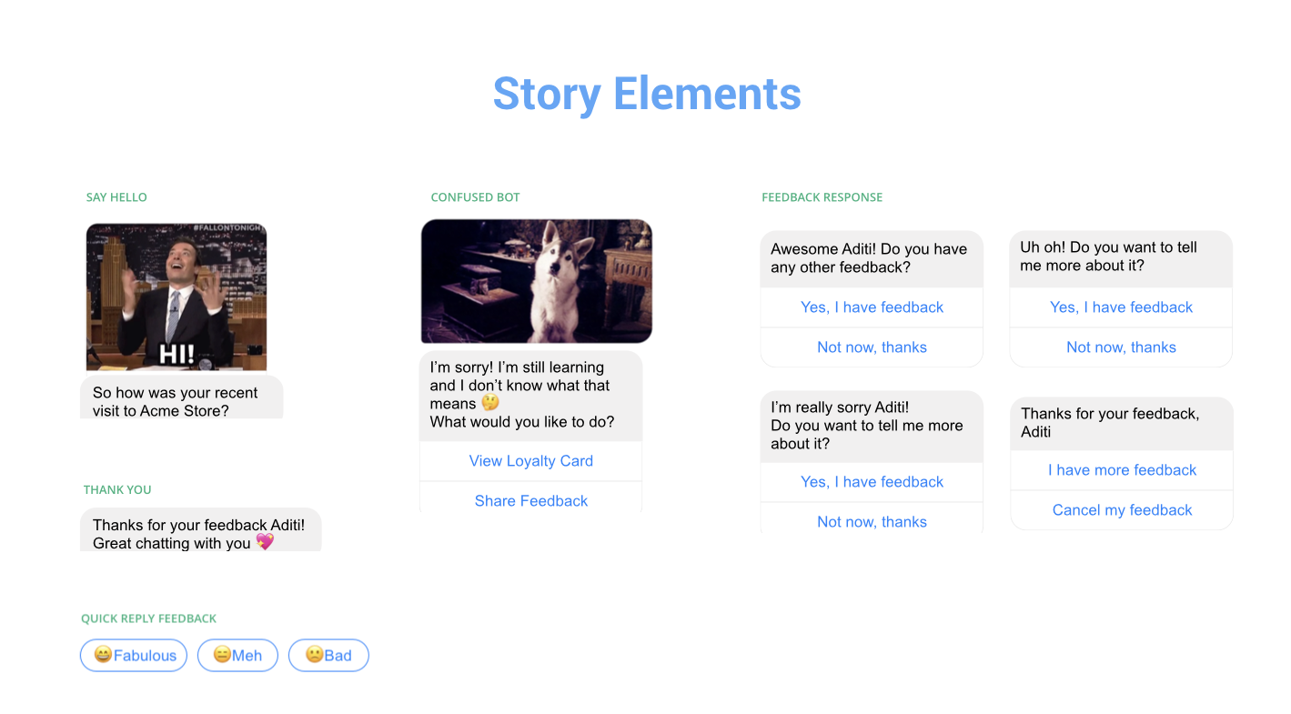
Once you have your Conversation tree and MVP script, create some visual story elements:
A few story elements from CandyBar Assistant
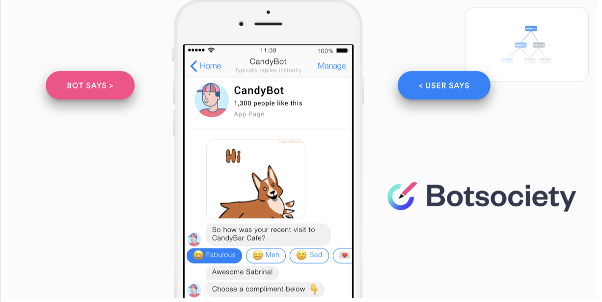
Prototyping is the best way to share your work
I recommend Botsociety for quick prototyping for your MVP
So in conclusion, basic design process is the same, but the tools you use are different.
3. Become a really good writer OR get a really good writer
Can’t underline this enough. Your MVP has to have good writing. It’s not optional.
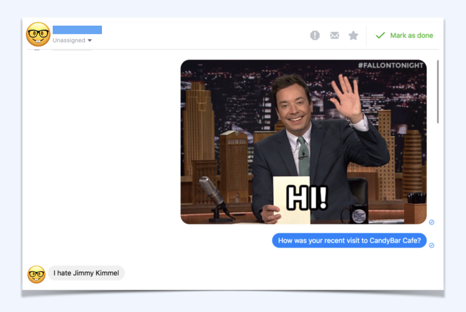
Getting a culture check is good too. Sitting in Singapore, we didn’t know this would happen with Americans using our bot. A surprisingly large number of people hate Jimmy Fallon
4. It’s ok to say sorry and I don’t know
Error handling is always important in any design process, it’s just way trickier in a conversation.
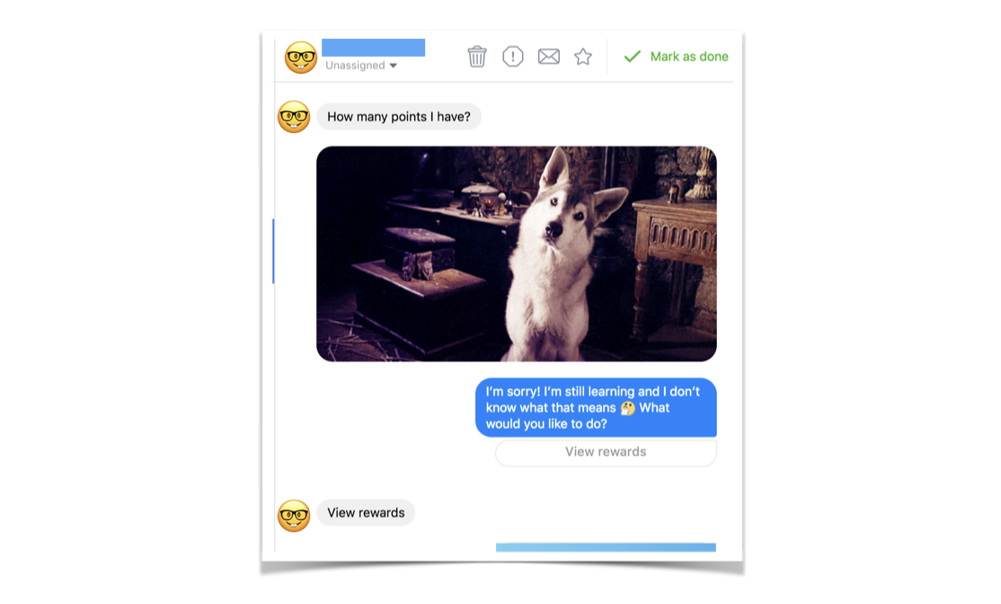
This person asks a pretty relevant question “How many points do I have?” but CandyBar Assistant doesn’t understand. It quickly apologizes, making it clear that it is limited, and provides a button so the person can find their answer anyway. By tapping on “View Rewards” this person can see how many points they have.
5. It’s not AI and it doesn’t have to be AI!
You are replacing a traditional interface of fields and labels with a rich conversation.
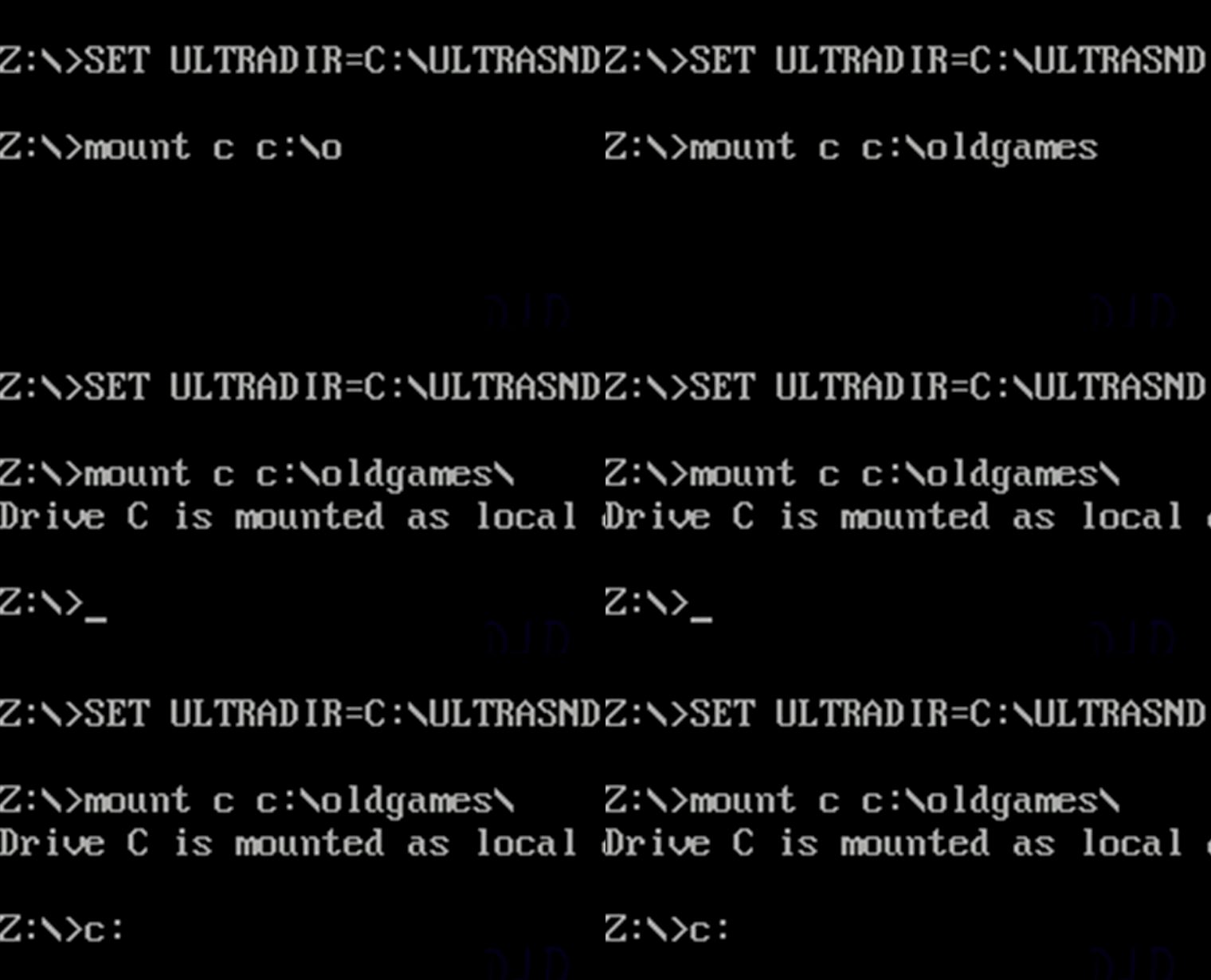
The bot reminds me of this olden days CLI
The bot reminds me a bit of this ancient command line interface I used to load up games when I was a kid. You put in queries, and the system did a thing. If you put in the wrong query, it failed horribly.
With an automated conversation, it’s pretty much the same Q&A format, just in a nicer, more human, friendlier wrapping. Maybe even some jokes, emoji’s and GIFS added to the mix!
You don’t have to have artificial intelligent to create a really really good experience for the people using your software that’s fun, enjoyable and also works.
TLDR:
Don’t make it look like a human.
Trust is fragile in an automated conversation
Design Basics are the same but your tools are different
Write your MVP script and test as much as possible
Get a really really good writer
It’s ok to say sorry and I don’t know
It’s not AI! It doesn’t have to be AI to be effective
Thank you for reading! This article is based on a talk I gave at UXSEA in Singapore, Nov 2018.
I’d love to hear your perspective on this, please add your comments below.


